

Maybe size really does matter
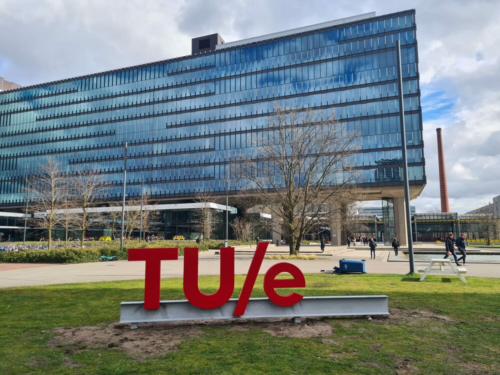
It appeared last week without warning: the bright red TU/e logo on the field between the Auditorium and Vertigo. It may well have drawn a disappointed response from anyone who occasionally visits the campuses of other Dutch universities. The T and U in capital letters, followed by the familiar slash, culminating in the lower case e. While other institutions show no hesitation in thrusting their full names in plastic lettering before the gaze of the outside world, we'll have to make do with our short signage. Could it be that size really does matter?
Okay, I hear you say, is this really something you, the editor in charge of Cursor, want to be getting wound up about? Yes, there are more important issues that our university is struggling with, searching for solutions to, or checking off as successes, I understand that, but for any pedestrian coming on to the campus from the direction of the train station, this logo is darned hard to miss. Not least because of its bright red color. It's undoubtedly going to become the campus's new talking point; people will have an opinion about it, they'll discuss it. Besides all this, this logo has an added charge for me because I wrote a piece about it in late January for Cursor, a well-read piece.
I find myself wondering whether we shouldn't have chosen different wording:
TECHNISCHE UNIVERSITEIT EINDHOVEN
or:
EINDHOVEN UNIVERSITY OF TECHNOLOGY
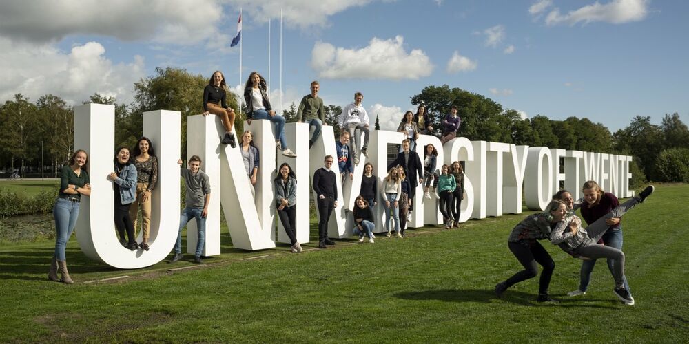
Just look how skillfully our sister institution in Enschede uses big letters in its vibrant recruitment campaigns. There's plenty of room between all those sleek capital letters for their smart, highly educated young men and women. That horizontal torrent of letters leaves no room for misunderstanding about just where they've pitched up.

If they ever had a Calimero complex over there in Twente, they've definitely squashed it with this letter megalomania. And they're certainly not the only university that has chosen to channel all kinds of lingering frustrations - a disappointing position in some or other ranking, or yet another Nobel Prize slipping through the fingers of one of their talented scientists - into white Perspex.
But let's just look at this from another angle. By using our logo in its most distilled form, might we here in Eindhoven not be making a very powerful statement? Doesn't the shining, inviting beacon that has for years graced the roof of Vertigo take this very form? Let the eager students keen to study exact sciences come to us. Half a word and a pithy logo is all they need.
This may indeed be the ultimate proof that we've shaken off the last of little Calimero's feathers, have come to realize that we've outgrown the need for towering letters intended to prove to the outside world that when it comes to education and science we really count. What's more, I would hazard a guess that our logo is a considerably cheaper option - the total cost of its manufacture by a metalworking company in Nuenen and its installation was 13,000 euros - than the sprawl of letters plopped down on many other campuses.
Discussion